A Dingbat Valentine

We've seen a LOT of great Valentine's Day cards this year and we don't like to play favorites.  But these great cards from Idaho's Dingbat Press are the ones our significant others will be receiving this year.  From the geek-chic Star Trek/Star Wars cards to the "Love Goes On and On" we're eating what Adrienne's cooking.  

The card aboe is printed on Arturo Celadon.  Check out her use of some of the other Arturo colors here.

Austin Press

Our friends at Bay Area design studio Austin Press just launched their online store.  Their cards are favorites of ours (and not just because many of them are printed on Rising Museum Board...)  Treat yourself and check them out.

In their words:

Austin Press is a small letterpress and design studio where magic happens! Located in the historic Pier 70 shipyard of San Francisco, AP is surrounded by the industrial maritime past, the bay, feral cats, and contemporary artisans. Inspired by the craftsmanship of days gone by, AP prints all pieces on a
19th century old-style press. Where elegance meets function. Each print is hand fed to create a unique impression. Image, text, and ink on beautiful paper.

AP aesthetic is informed by rare books and turn of the century ephemera. Or any curious, small object that conveys a sense of beauty.

Digby & Rose

Wasington, DC art studio Digby & Rose developed a printing technique known as the Compression Plate Process (tm) that "enhances the rich texture of regular letterpress printing, resulting in a 50% deeper press."  It also really makes the colors pop and adds a lot of flexibility not always available with letterpress.

We sent them two dozen(ish) papers to experiment with to see how their process performs across a range of different papers.  We'll report back in a few weeks.  


Tour de Lead Graffiti

Delaware-based Lead Graffiti came up with an awesome project built around the Tour de France and printed on Somerset Textured.

In their words:

We will watch each stage of the Tour de France, look for usable moments or incidents or comments, go to lunch (we have a number of guest printers joining in and we want to give them a chance to add their ideas to the day's poster), get started on how to represent the stage using wood & metal type, wood or linoleum cuts, and objects related to cycling that are usable for the 15" x 22" poster.

The Tour de France has 21 stages and 2 rest days that we will interpret. In addition, we'll produce a portfolio title page, a page that will describe what we were thinking for the images during each stage and what the image / layouts were taken from, and a colophon page listing the physical elements of the project, who did what, etc. We will also have guest participants who will contribute to the process in various ways. All who are involved will sign the poster they are involved in.

Now to see if we can keep up with our 12- to 18-hour days for 23 consecutive days.

"I like to watch her sway. She's luck before I'm going away..."

Kim Austin & Austin Press has been a favorite of mine for a while now, ever since our first conversation when I said "there's a song with your name - know it?" (turns out it is about her).  

Austin Press has been churning out "fine letterpress ephemera" since 1994.  She uses Rising Conservation Board for a lot of her work and has lately started adding color using Colorscope

Of her non-letterpress work:

Working since 1989, Kimberly Austin has produced photographs on silk, muslin, wood, and paper. She works exclusively with vintage photographic recipes, Van Dyke, Cyanotype, and Gum Bichromate, and mixes all emulsions by hand in her studio. Her images are built up from consecutive printing, either through multiple runs of translucent emulsions, or by layering images on transparent silk and vellum. 

The content of Austin's work focuses on conceptions of normal behavior and development. She has worked extensively with portraits, vintage illustrations, text excerpts, and most recently personal documents from her family history. In each series she has focused on the discrepancy between societal expectations of the individual and the reality of being human. Her work continues to explore this delicate balance, exposing our vulnerability to a seemingly unending cast of social mores and accepted modes of healthy living.


What's Cookin'

We're proud of our collaboration with 15 letterpress printers and designers on a project to promote the art of letterpress printing.  We hand-selected a different paper for each printer who was on their own to design and print a recipe card to be part of a set that can be collected at the show.  Amber Ellis-Seguine of Flywheel Press was the mastermind behind this project and, somehow, made it all happen in time for the show.

The cards were all amazing.  We were totally blown away and we're sure you will be too.

Have a look for yourself

34 Typographic Sins

I might be a little late on this one, but our friends at Rowley Press printed these limited-edition signed letterpress posters "expounding the 34 most horrific Typographic Sins known to humankind."  Designed by Jim Godfrey, originally to help in "educating his students on some of the more common mistakes made when designing with type."

Apparently the Font Police had a lot to say about it but I'm loving it for the concept and the amazing printing.  

See more images and read about the printing process and challenges here.

The Royal Wedding

1,900 of their closest friends and family members received Prince William and Kate Middleton's wedding invitations.  

Here's what we know:  the card was thick enough to have gilded, beveled edges.  The print was engraved, the card is 10x6 (ish).

Anyone know anything more?  What paper?  Who printed it?  Why I wasn't invited?

Cake Makes Paper

Cake, the band not the food, work with SF Center for the Book to create blockprint handmade lyric books for their new release - using paper made from their shirts.  Great feature on it here showing the entire process.

The limited edition of 1,000 handmade packets was produced in Berkeley, California in true DIY fashion by project coordinator Pam DuLuco and her team. Using natural and recycled components and throwback printing methods, they carved printmaker Rigel Stuhmiller’s bold illustrations into linoleum.

Lead and wood type were used to hand-press the words onto paper crafted from the Cake wardrobe discards and jute coffee sacks. Binding thread was hand-spun and coated in beeswax drawn from DuLuco’s personal beehive.

Lunchbox Notes

Kelly McMahon, from Mayday Studio in Montpelier, VT, came by on Friday with Shelley from Albertine Press (see prev. post) with to talk paper, printing and about a top secret upcoming project to be unveiled in May.

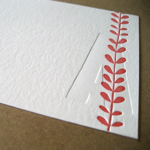
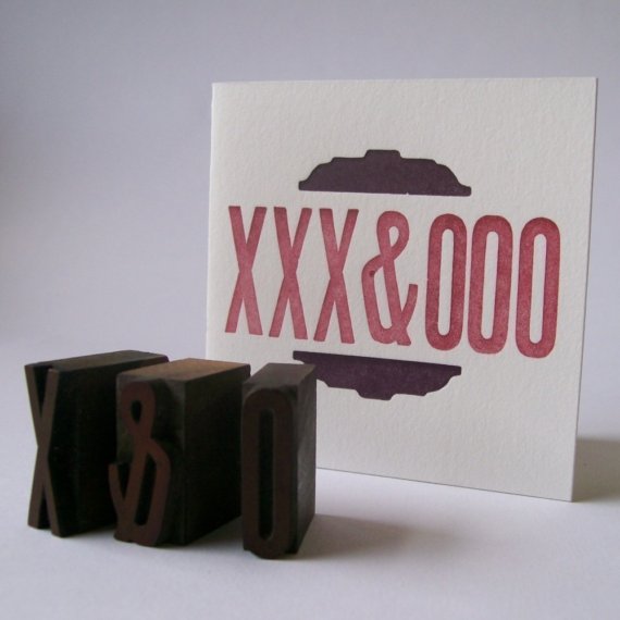
One of the things that came up was how well Kelly found Coventry Rag to fold, especially for a heavier 300gsm paper.  In our dream, Kelly then volunteered to quit her job and spend sixty hours a week being a copywriter for this site and the forthcoming new version of LegionPaper.com.

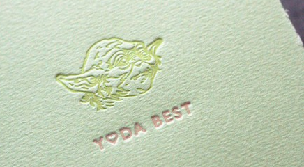
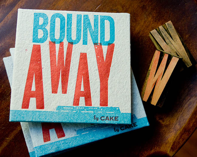
So to kick off the week, check out these great Lunchbox Notes created by Mayday on Coventry Rag.  These 3x3 cards are perfect as gift cards.  Or, for those of us who spoil their children with paper goods because we're in the biz, actual lunchboxes.  (Can't you just feel the jealousy in the lunchroom?!  "Is that an actual letterpressed card?  I'll trade you my lunch for it!")

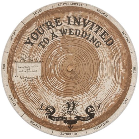
Coventry Rag can be found here, here, here, here, here and anywhere else you can find gorgeous, well-folding cotton papers.
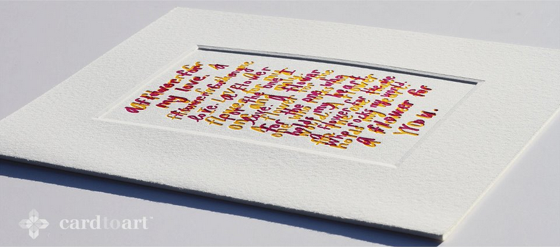
"Are You A Kathleen Or An Elizabeth? A Keith Or A Country Joe?"

"Are You A Kathleen Or An Elizabeth? A Keith Or A Country Joe?" is a gate fold letterpress print created by Providence's CW Roelleand DWRI Letterpress. The artwork measures roughly 10" high by 20" wide when open. Folded, the print measures roughly 10" high by 10" wide.

Each letterpress print has been signed by the artist and blind debossed by the printer with the print's number and edition information. It is printed on St. Cuthberts' archival 300gsm Somerset textured printmaking paper in a natural white. The gate fold features a deckle edge.

In honor of his dog Owen, CW Roelle has chosen the SPCA of Anne Arundel County as his artwork's charity. The SPCA works to promote humane care and concern for animals by educating the public and by working to end pet overpopulation, to provide shelter and rehabilitation to animals in need, and to work for the passage and enforcement of laws which promote and provide for the humane treatment of animals. $250 dollars from the sale of CW Roelle's print will be donated to the organization.

BirdDog & Bamboo

Alli Bozeman, founder of Colorado-based BirdDog Press is a fellow paper person we can get behind.  In her words:

From fancy to alternative from local to european, we offer recycled, tree-free, plantable, cutsom handmade, cotton, linen, bamboo, wood veneer, ultra thick, brightly colored, finely textured and duplexed papers.

Sounds familiar...

See more of BirdDog's work.