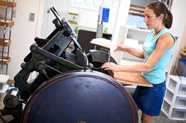
Trip Print Press
/Can't see getting tired of great videos like this anytime soon. This one from Trip Print Press in Toronto.
Can't see getting tired of great videos like this anytime soon. This one from Trip Print Press in Toronto.
Wasington, DC art studio Digby & Rose developed a printing technique known as the Compression Plate Process (tm) that "enhances the rich texture of regular letterpress printing, resulting in a 50% deeper press." It also really makes the colors pop and adds a lot of flexibility not always available with letterpress.
We sent them two dozen(ish) papers to experiment with to see how their process performs across a range of different papers. We'll report back in a few weeks.
Washington, DC art studio Digby & Rose developed a technique they call Letterpress Light.
 Logo by Honizukle Press52 Weeks of Mail is an awesome project started by Etsy to "encourage people to be more intentional about relationships and keeping in touch with friends and family by sending out a card or letter each week, for the next year."
What can be bad about that? Who doesn't like to see a handwritten card in the mailbox amongst all the junk mail and bills?!
Spread the happiness, everyone! Starting October 9.
 Creative Mornings is a monthly breakfast lecture series for creative types. Think of it as a local morning mini-conference and inspirational community boost before work. Nothing fancy, just good people and a great talk by a guest lecturer.
Free events are held in 16 (and counting) cities around the world. In the US, the lineup included NY, Chicago, Portland, Los Angeles, San Francisco, Chicago, Boston, Atlanta and Seattle.
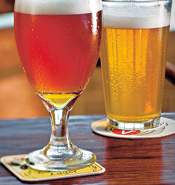 You spoke, we listened. Introducing Neenah Blotter Papers - perfect for making letterpress coasters.
The paper has surface sizing so that the sheet accepts offset printing as well as letterpress, foil stamping, embossing and die custting. It's also a great paper for fragrance strips and air fresheners.
24pt, acid free, fully recyclable.
 Now that THE biggest wedding event of the year (according to TMZ) is over, we can write about the all-important Kim Kardashian & Kris Humphries wedding invite.
Our friends at Lehr & Black designed and produced these elegant invitations using 100% cotton Rising Museum Board 8-Ply White and Esse Pearlized White.
"We chose Rising due to its extra thick weight that was necessary for the rich quality of the invitation," said Sol Lehr. "We bevel-cut around the card and Rising was the ideal board that held up perfectly to produce a razor-sharp clean bevel. The 100% cotton feel of Rising contributed to the card's deluxe quality."
The invitation was letterpress printed, hot-stamped and embossed. Click here to see more images of the invite.
 We thought it appropriate to re-post this article in today's Wall Street Journal.
The article presents the overlap between the digital and analog world that many (most) people in the letterpress community experience. Social media tools have made it easy for small letterpress shops to communicate and share ideas with one-another.
There was also a nice shout-out to our friends at the Ladies of Letterpress and Boxcar Press.
Interesting post from Australia on what makes a good letterpress paper.
|
What's special about letterpress papers? The Artisan Press uses a range letterpress friendly papers from the leading fine art paper mills across the world. Some of these mills were producing paper in the 13th century – well before the advent of the printing press! For example the Magnani mill in Italy, customers include Napoleon Bonaparte, the reigning families of Europe and the state mints of several countries. It's a little special and one touch will tell you why. |
 We're getting fired up! Looking forward to seeing everyone next week in NC.
Make sure you stop by our table and say hi.
We've seen the video of the LetterMPress app too many times. Needed a dose of reality.
The Power of Making - Upside Down Left to Right from ORDER on Vimeo.
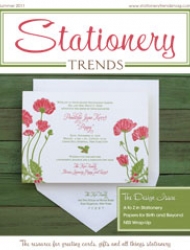 Our latest column in Stationery Trends features two of the oldest paper mills in the world: Zerkall and Magnani. Check it out.
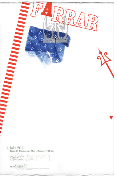 Delaware-based Lead Graffiti came up with an awesome project built around the Tour de France and printed on Somerset Textured.
In their words:
We will watch each stage of the Tour de France, look for usable moments or incidents or comments, go to lunch (we have a number of guest printers joining in and we want to give them a chance to add their ideas to the day's poster), get started on how to represent the stage using wood & metal type, wood or linoleum cuts, and objects related to cycling that are usable for the 15" x 22" poster.
The Tour de France has 21 stages and 2 rest days that we will interpret. In addition, we'll produce a portfolio title page, a page that will describe what we were thinking for the images during each stage and what the image / layouts were taken from, and a colophon page listing the physical elements of the project, who did what, etc. We will also have guest participants who will contribute to the process in various ways. All who are involved will sign the poster they are involved in.
Now to see if we can keep up with our 12- to 18-hour days for 23 consecutive days.
Happy Fourth of July everyone!
The Alphabet from n9ve on Vimeo.
Curated by Graham Bignell & Richard Ardagh, Reverting to Type showcased the work of twenty contemporary letterpress practitioners from around the world.
Reverting to Type from Lima Charlie on Vimeo.
Random sentence in a book we're reading:
"Sometimes, when it's going badly, she wonders if what she believes to be a love of the written word is really just a fetish for stationery. The true writer, the born writer, will scribble words on scraps of litter, the back of a bus ticket, on the wall of a cell. Emma is lost on anything less than 120gsm."
(quote: david nichols)
Your kids watch you print and see what you do (and in some cases are unpaid, um, assistants). Now let them see what their work looks like off the press. Jigsaw Graphics will turn their drawings into letterpress prints. (We found this via Babble.com)
Great article from Adrienne at Dingbat Press on her experience exhibiting at the National Stationery Show. A great look at everything that goes into exhibiting.
 Kim Austin & Austin Press has been a favorite of mine for a while now, ever since our first conversation when I said "there's a song with your name - know it?" (turns out it is about her).
Austin Press has been churning out "fine letterpress ephemera" since 1994. She uses Rising Conservation Board for a lot of her work and has lately started adding color using Colorscope
Of her non-letterpress work:
Working since 1989, Kimberly Austin has produced photographs on silk, muslin, wood, and paper. She works exclusively with vintage photographic recipes, Van Dyke, Cyanotype, and Gum Bichromate, and mixes all emulsions by hand in her studio. Her images are built up from consecutive printing, either through multiple runs of translucent emulsions, or by layering images on transparent silk and vellum.
The content of Austin's work focuses on conceptions of normal behavior and development. She has worked extensively with portraits, vintage illustrations, text excerpts, and most recently personal documents from her family history. In each series she has focused on the discrepancy between societal expectations of the individual and the reality of being human. Her work continues to explore this delicate balance, exposing our vulnerability to a seemingly unending cast of social mores and accepted modes of healthy living.

We're happy to provide you with recommendations, help solve any paper-related issues or help you design your own paper.

We’re happy to provide you with recommendations, help solve any paper-related issues or help you design your own paper. Ask an expert >

Getting the exact size paper you need is a process that requires skill and experience to assure a quality cut every time. We offer worry free paper cutting to the size you need. Read More >
See and feel the paper for yourself! We have a huge sample library with over 3,000 different papers. Go to sample library >
Copyright © 2014-forever. Letterpress Paper.
All rights reserved. Site by CR


